Thursday, March 12, 2015
Colour and its relationship to usability
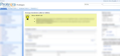
As I returned to work the following week, I noticed that a change was made to our internal dashboard at Protegra. A reminders and announcements section was added and highlighted in yellow/green while the rest of the site remained in blue. Everytime I looked at this site and my eyes were drawn to the words highlighted by the use of colour I thought of Davids presentation.

Here are few other examples that David showed to us to demonstrate how the use of colour could be used to influence user behaviour effectively:
1. Twitter
What are they trying to get you to do?

Sign-Up is highlighted in yellow to attract new users while Search and Sign-in are blue like the rest of the site. Twitter is assuming that if you are already signed up then you are committed to finding the Sign In button on your own.
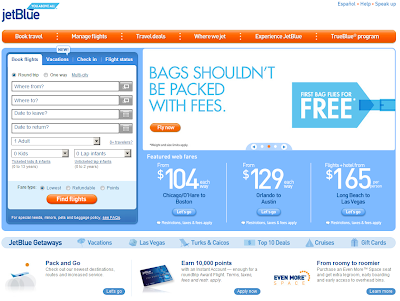
2. JetBlue
What is important to them?

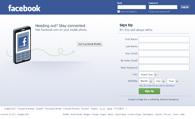
3. Facebook
What are they trying to influence you to do?

Davids presentation has peaked my interest and Ill be looking to find other ways to use colour like this on projects (external facing or not) to guide the user to the actions we would like them to take and discourage them from unwanted actions or workflows. Also, as the Dashboard example shows, it isnt just about highlighting buttons - it can also be about highlighting sections of the site.
Thanks David.
You can find more positive and negative examples and other UX strategies in his presentation found on his site - or join us at SDEC11 to hear him present.
Subscribe to:
Post Comments (Atom)
No comments:
Post a Comment
Note: Only a member of this blog may post a comment.